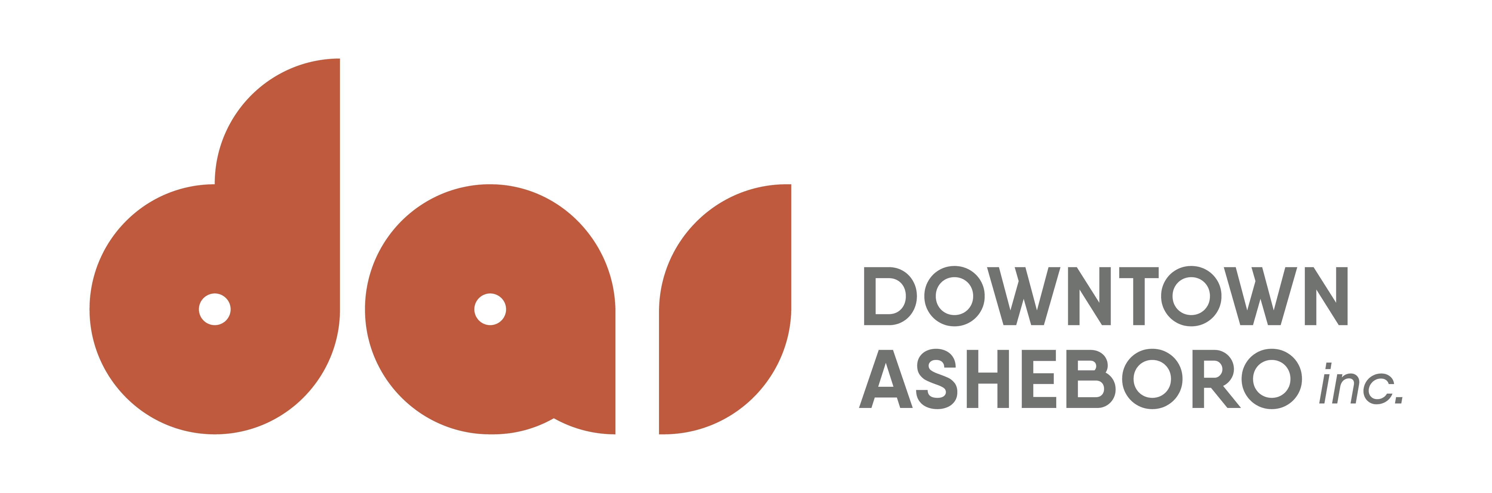
The Downtown Asheboro Inc. (DAI) logo, designed by Randolph Community College student Cameron Surratt.
Every fall, Randolph Community College’s Design of Advertising class learns what it’s like to work with an actual client, each student designing a logo for a local company. At the end of the project, the client chooses the student’s design that is the best fit, giving the client a fresh logo and the student a foot in the graphic design door.
Despite the COVID-19 pandemic, fall of 2020 was no different as Design Programs Department Head Lisa Hughes had her students design a logo for Downtown Asheboro Inc. (DAI), which is part of the Main Street program — an N.C. Department of Commerce program that started 40 years ago to help small towns in the state revitalize their downtowns.
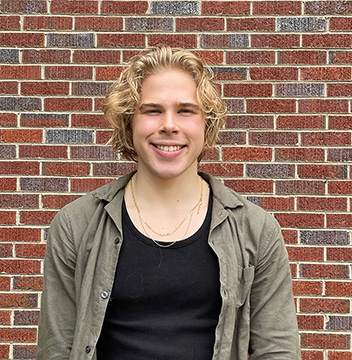
Surratt
In the end, DAI chose Cameron Surratt’s logo. The transfer student, who graduated from Asheboro High School in 2019, said that, despite having done freelance graphic design pre-RCC, this gave him the live-client experience that will help him post-RCC.
“I had never really worked back and forth with clients,” he said. “So communication, and trying to get ideas out and pass between both of us was a new experience. Both sides have an idea of what they want. It’s slowly narrowing down that and getting used to the whole professional process. … It was a fun experience, and I’m really glad it worked out the way it did.”
Surratt added that school projects usually mean a bit more freedom of expression, and there is a lot more compromise with clients. Another big lesson from the project? Deadlines.
“We went through quite a few different stages of changes,” he said. “I’ve got a bad habit of just procrastinating until the end.”
DAI Executive Director Rebekah McGee said choosing RCC to design its logo was a no-brainer.
“We understand the value of our emerging students,” she said. “It was also a personal decision for me as I remember very clearly being in college and feeling like that, while school was applicable to the real world, it wasn’t ‘real-world work.’ So many people, even with college degrees, have a hard time getting a start in their career field. I wanted to give a student that chance to see their work, even while still in college, in use and possibly us in their portfolio for jobs in the future.”
The process starts with meetings with the client to introduce the job. Midway through the project, the client comes in and gives critiques on what they like or don’t like, narrowing down the field of potential designs. It is up to the client to decide what works best.
“I cannot begin to describe how enjoyable the process with Lisa went,” McGee said. “We had timely updates, original drafts, and revisions. She kept me up to date with where the students were in the design process, and when to expect the next round with edits. … I am looking forward to partnering in the future for several other projects.”
Of course, the COVID-19 pandemic threw a wrench in the process, which didn’t allow McGee to meet with students during the preliminary process. Thankfully, the final presentation took place in a socially-distanced setting.
In the end, Surratt’s design was the winner.
“Originally, they were wanting to mirror the City of Asheboro with similar colors and have icons of stuff to do in Asheboro,” he said. “From the start, I recommended against that, which probably isn’t too good with clients; I was recommending they be their own thing. I made a few logos that fell in with what they wanted, but, more and more, they started liking the stuff that was further away from what they were expecting to want. … Originally, they wanted those four colors, but when they decided on the logo, they told me to just make a page of as many different color combinations as I could think of.”
The result is a stripped-down, modern-looking “DAI” with just two colors — a deep, orangy-red and a soft gray.
“Cameron was one of the most interactive students,” McGee said, noting that she invited the students to email or call her to discuss any direction or revisions, and Surratt was one of the few who did. “He also asked for some creative freedom. I often say, ‘I know what I want, but I’m not an artist.’ So, I gave him creative freedom.
“The logo was one of the ones that came from him, without the original direction of what we thought we wanted. It encompassed the modern feel of what we were looking for in our organization. We represent the historic downtown, but we do not want to be stuck in the past. The colors used in the logo are Sunset Auburn and Evening Gray and I love that there is a nod to Sunset Avenue. It also gave us the freedom to expand in the future if we wanted to add emblems for the seasons. I honestly loved the logo when I first saw it, but my excitement for it has grown even more. It’s just fun and modern and doesn’t box us in a specific direction.”
The logo has been featured in DAI’s marketing material and also for a large advertising campaign in December where commercials ran every day on major news stations — meaning Surratt’s logo was seen thousands of times.
“The most important thing with a good design is that you don’t notice it,” he said, noting he and his mom, a graphic designer and RCC graduate, used to play a guess-the-company-behind-the-logo game. “Once you see it, you know what it’s for, but you don’t consciously think about it. To think that, at some point, my logo could become something like that — especially if someone sees it on TV and says, ‘Oh, I need someone to do something like that for me.’ It’s really exciting. To have something that’s properly professional, is really cool to see.”